Recently a friend reached out to me to ask for some advice about academic poster designs. He knew I had designed several for my department and he wanted some input on how to go about creating something that would stand out.
I told him our process was slightly different from others since, as a graphic designer, I could create something that wasn’t your standard academic poster. The process typically involved the author(s) gathering and writing the content for the poster, and then coming up with a metaphor that could visually represent what they felt they wanted to convey.
With some posters, the metaphor comes easily, while others require more brainstorming. Once the metaphor has been established, the task of creating the poster begins. I translate their instructions into something that I hope is aesthetically pleasing, informative, and eye catching. Since content is the most important piece of the equation, I keep in mind that I have to leave space for the text that accompanies the graphics, while making sure that text is readable from a fair distance.
None of this is last minute. We plan and make sure to give ourselves enough time to create the poster since it is a process that can take quite some time. You can view examples of the posters I’ve designed for CTL by visiting my portfolio website. This will give you a sense of how we use metaphors in the creation of our academic posters.
After explaining our poster creation process to my friend, he was interested in using a metaphor as part of his design, but didn’t think he could create anything as elaborate as I had done. He, like many other academic poster creators, doesn’t have the skillset or the software to create anything I could. I offered to help as much as I could, but he didn’t feel comfortable asking. He did some Googling and then sent me a video called How to create a better research poster in less time – (#betterposter Generation 2) by Mike Morrison.
You may be familiar with Morrison, or his #betterposter movement, which he started in 2019 with his #betterposter Generation 1 video. His first video has almost 800,000 views and his #betterposter generation 1 poster template has been downloaded more than 250,000 times. This was the first time I had ever heard of the movement or seen either video, but if you have 21 minutes to spare, I highly recommend you, at the very least, watch his generation 2 video. This video is accompanied by citations and research listed in the description that he’s done on poster and user experience design. It’s obvious he’s given this a lot of thought and is very passionate about the subject.
The videos really got me thinking about our process and whether it is as effective as it could be, and how difficult it must be for someone like my friend to create something visual without the software or skills I have.
At this point, I will go over some points that Morrison makes and give my thoughts on them. And then I want to share what my friend came up with for his poster design, and my contributions to his design.
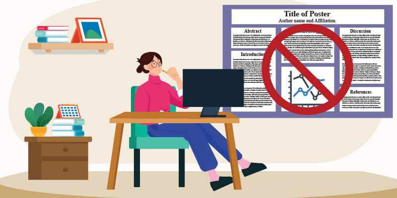
Morrison states that most people start off by wanting their poster to stand out, to attract attention from many conference attendees, but what can happen is that it is left to the last minute, and an older poster is typically used as a template with old content replaced with new content. There are other factors that play into this as well, but for the most part, this academic poster design hasn’t changed much in the last 30 years. Some of these academic posters have so much text and information crammed onto them that they end up looking like, what he refers to as, a “wall of text”. We’ve all seen it, and I am also guilty of having created a couple of posters like that.
I’ve always believed less is more, and keeping it simple, and the graphic design principle of white space, so I’m all for having less on a poster. Some important information might need to go, but it can always be made available in a handout, or better yet, accessed via a QR code. Most people have mobile devices which can scan QR codes that can link to everything you feel is necessary for someone to see, including your paper or research.
One suggestion he makes is to have your title really stand out on your poster so that it gives off a “strong information scent”. Typically, poster titles are written very academically, so he suggests that poster creators rewrite the academic title to sound more casual, with easier to understand language, with as few words as possible in a large font size. This new title could even be a direct finding lifted from your abstract or conclusion. For all intent purposes, this new title, or statement, is now your new your focal point, and its goal is entice people to stop and engage with you about your statement instead of asking the very typical “tell me about your poster” that is commonly heard at poster sessions.
Morrison also suggests accompanying the new title with a related graphic, an illustration of a process, or an image from your study. Something that can be interpreted quickly. Next, use colours and fonts that can trigger an emotional response from viewers as they are walking by. Finally, try doing something on the poster that is fun and creative, for example, using pathogens as bullet points if your research deals with pathogens.
Morrison believes that the wall of text bombards people with too much information and nothing penetrates, whereas his poster design features one or two insights that easily land into people’s minds.
The first version of his #betterposter left room on the sides for more information, albeit in a smaller condensed format. Based on feedback, he has developed a few alternatives to the first version and his newer templates offer instructions on how to create QR codes, where to get graphics from, design tips and much more.

In his past work life, Morrison used to work as a web developer specializing in user experience. As a graphic and web designer, it was obvious to me that he had some background in user design based on terms he used throughout his videos and what he ultimately came up with.
Some might think his approach is extreme. Others praise his design tips, with some on Twitter saying they’ve won poster awards using his design. I do agree that the wall of text equates to information overload. I find a lot of academic posters are long on information and short on design, but I do wonder if his design takes away too much substance. If you’ll pardon the analogy, it’s almost as if the #betterposter transforms the poster into a teaser trailer, instead of a standard trailer. I guess a question you can ask yourself when creating your poster is: can a conference attendee get all they need from a poster if the poster presenter is not there?
I also think that if the #betterposter movement really takes off, then the wall of text look will be replaced by the #betterposter look. In essence, one look will replace the other, and all the posters will appear the same in appearance and style with nothing really standing out.
Getting back to my friend’s poster, he came up with a graphic or metaphor that complimented his study. His research is based on residents who work at hospitals who take side gigs. This is commonly referred to as moonlighting, so he thought having an image of a moon would work in his poster.

This is a draft of what he sent me, which he created in PowerPoint. As you can see, this poster design is a mixture of conventional and #betterposter design. There is still a lot of information off to the sides and a conventional title up top, but the majority of the poster is taken up by a picture with a moon in it and a strong statement about the results of their study just like Morrison suggests.
There might be too much content off to the sides (the smaller font size might make it harder to read), but at the same time, this might be enough to tell the story of the research. This particular poster session was virtual, which included a short, pre-recorded video of the poster presenters. However, the poster also needed to stand alone and tell the story of the research without the presenters.
Finding that balance is key, and if you feel your poster needs more text and content, then do what you have to. My focus for this poster shifted to the graphics in the poster: the QR code, the logos and the image.
Both the QR code and logos were in raster format, meaning they were jpgs. I’m not a fan of jpgs that could just as easily be vectors. Raster images don’t print as sharply as vectors and can be larger in file size. Finding the logos in vector format took a while. I couldn’t find the North York General logo anywhere, so I downloaded one of their annual reports and sure enough, the logo on the cover of the report was a vector graphic I could use. I was able to open the cover of the report in Adobe Illustrator and then saved it as an EPS graphic which could then be imported into PowerPoint.
I was able to find a University of Toronto logo, but not with the word Psychiatry, so I had to find out what font was used in the graphic. To do that, I used What the Font, a website which analyzes text on a graphic and tries to figure out which font was used. Luckily, I was able to do that with this logo graphic as this process isn’t always successful.
Moving onto the QR code, I created a new one, which was done using a QR code creator website (there are lots of them), and then output the code as a vector. Since it was available as an option, I chose to have the innards of the QR code to be made up of little circles instead of squares (a play on the moon being circular). Since it was a vector graphic, it was transparent and could be put over the image.
For the image my friend managed to find a creative commons image. Free is great, because it’s free, but you typically get what you pay for, and to me, like most free graphics, it wasn’t very good. Luckily, I have access to a photo library. I was thinking to replace his picture with one of a hospital at night, but I couldn’t find one. We figured since the hospital and researchers are in Toronto, we could just use a nighttime shot of the Toronto skyline. Using this same photo library, I found an image of the moon which I then composited into the photo using Photoshop. I also darkened and extended the sky so that I could put text above the city.
This is the version I sent him.

His poster was pretty good and could have been submitted as it was. I was able to use some of my skills, software, and access to assets to slightly enhance it. Sometimes it doesn’t take much, although it might involve spending a few dollars to get the perfect image or graphic for your poster.
With the pandemic, and a lack of conference attendance, it’s been a while since I made an academic poster. When we go to create the next one, I will definitely talk with the authors about what we can do differently, and if we want to try something new. Maybe the #betterposter movement will do the same for you.

Peter brings extensive expertise in multimedia to support CTL programs, website design, and special events. With around 25 years of experience in graphic and web design, he brings a wealth of knowledge to the table. He is a graduate of Print Journalism and Digital Media from Conestoga College, and and Communication, Media and Film from the University of Windsor.


Comments